David Bellamy – Where do I stick the boat?

Many people find painting boats a challenge, and although they love working on harbour or coastal scenes where boats are featured, it is often the rendering of the boats that lets them down. Some boats, of course, are notoriously complicated and awkward even for the professionals, but here I’d like to offer some help and a few tips for those who find these fascinating subjects rather a struggle.

This watercolour is part of a small painting on Waterford 300lb rough paper, where I have included a few small dinghies that together with the figures form the focal point of the composition. Pushing boats into the middle distance like this makes them considerably simpler, and yet they can still be the centre of interest. By having them broadside on to the viewer you will eliminate those often excruciatingly difficult curves which may be present when you look at them from a side angle, but you can still give them a gentle rake where the top of the gunnel curves slightly upwards to the prow. If you are working on a reasonably large boat that is broadside on, closer to the foreground then use the shallower curve of French Curves to help you. With more experience work on more challenging boats.

Keeping the figures close to the boats emphasises the two elements as a focal point, but you can also use figures to hide those parts of the boat you may find awkward. Tarpaulins, netting, buoys, oars, lobster pots and all manner of seafaring detritus can also be used to break up parts of boats, as well as adding colour. Of course, you may be painting a truly picturesque harbour and find the main boat in the scene is a complicated mess and not at all attractive. Leave it out and substitute another, more handsome craft to your liking. It pays to sketch and photograph really good individual boats from all angles and at a variety of distances so that you can use these as substitutes in a composition. 

A few years ago I filmed a number of scenes painting on the coast aimed at a DVD to release with my Seas & Shorelines book, but I mislaid the footage and the book came out on its own. However, I found the coastal footage a while back and this has now been produced as a new Seas & Shorelines DVD, which can be bought on its own or as a special book & dvd offer and this is solely available from my website. It contains many tips on painting boats as well as other maritime subjects. There is also a clip of the DVD on You Tube.

This is not the best time of year for getting out to sketch in the landscape, but given the problem with Coronavirus you may well feel the effort is worthwhile. I spend a lot of time outdoors and on Saturday went up the Black Mountains to paint some snow scenes. Being out in nature is one of the best antidotes to our current situation, but make sure you wrap up warm. I visited Cotswold Outdoor a few days ago to get some new sketching gloves and they have two or three excellent versions which are thin, warm and ideal for sketching in cold conditions. There are naturally many tips for working outdoors in winter in my Landscapes Through the Seasons in Watercolour book. 

    Enjoy your painting!

David Bellamy – Making the most of summer landscapes

I’ve at last managed to see my grand-daughter after nine months…..far too long a time, but the re-union was a wonderful moment! Bit exhausting as well, keeping up with a lively 3-year-old. That, and other urgent work has kept me from doing any blogs for 6 weeks, I’m afraid.

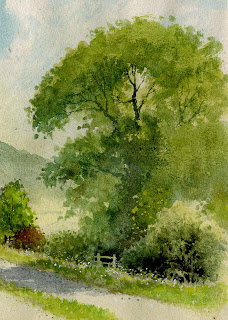
Summer still clings on with some beautiful days, the trees in fine form. When painting summer trees in full leaf I find it easiest to do the foliage in two stages, firstly the lighter colour – usually green – and then the darker, shadow green. It pays to run your branches into the darker shadows, losing them naturally rather than in stark contrast. Make sure you stab little spots of the green outside the main boundary of the foliage as you see in the watercolour below, otherwise your foliage will appear lumpy.

Just above the stile and slightly to the right you will see some light spots of yellowy-green. These were achieved with gouache, which being opaque will show up over dark areas, unlike pure watercolour, and here they suggest detail within a dark, featureless part of the tree. The stile and some branches in the bottom right-hand bush have been done with the negative method whereby the darkest passages have been painted with a fine no. 6 sable brush to avoid those features.

This painting is featured in my new book Landscapes Through the Seasons, to be published shortly by Search Press. Amongst other things, it includes introducing flowers into the landscape, managing summer greens, brushwork for foliage, the power of introducing spot colour, coping with riotous summer foregrounds, emphasising a sense of spring and fiery autumn colours. The book is actually an extension of my Winter Landscapes book, as so many have enquired about one on summer landscapes. You will find details on my website, www.davidbellamy.co.uk in a few weeks time.

Make the most of what is left of summer and make sure you gather as many subjects to paint in sketch or photographic form before winter arrives and we get any further lockdowns. Painting is such a wonderful antidote to Covid-19!!!

David Bellamy – On-line watercolour workshop of a Mountain Painting

I write this as a follow-up to my online workshop this afternoon on Shopkeeparty, which was a simple 45-minute demonstration in watercolour of the Middim Khola River in the Nepal Himalaya where I led a trek and paint group in 2000. The aim was to demonstrate how to achieve a sense of space and distance, create a tranquil mood in dramatic backlighting, dropping in spot colour and illustrating several brush techniques.

This shows the finished painting: I added a little extra sparkle by scratching with a scalpel below the trees and finally painted in a few dark blobs in the foreground to suggest larger stones in the river, but otherwise it is basically as completed during the workshop. If you took part I hope you enjoyed the experience and if you missed it you can still find it on Youtube

Next Tuesday, 11th August I will be running a watercolour Masterclass again with Shopkeeparty, and this will last around 2.5 to 3 hours. The subject will be Blencathra mountain in the Lake District with Thirlmere in the foreground, and of course with much more time I will be covering so much more, showing mountain structure, atmosphere, reflections in still water, massed and individual trees, crags, how to introduce more colour naturally, brushwork, negative painting and much more. I will be using my favourite, Saunders Waterford paper. Details are available at    https://shopkeepeasy.com/davidbellamy   You will be able to ask questions throughout and we will move at a pace that will ensure you can keep up with the painting being demonstrated. The Masterclass painting will bring in more colour than the above scene which was aimed at creating a strong moody backlit subject.

In the meantime, enjoy your painting!

David Bellamy – Creating a Splash

One aspect of life I am really missing in lockdown is being by the sea, and especially my native Pembrokeshire with it’s incomparable combination of sandy beaches and stunning cliff scenery. I’m desperately in need of being splashed in the face by some wild breaker crashing on the rocks, so I thought you might like to see how I tackle these fascinating actions of the sea.

This is the sort of sea that all self-respecting sailors should be indoors, but the kind I love to catch in a sketch. Just being there and observing what happens when the sea crashes onto the rocky anvils helps you understand what is going on, and happily it is repeating itself all the time. I often stand mesmerised by these moving images, then snap out of my reverie and consider how I would render the effect in watercolour. By watching every part of that moving scene in succession you will learn a lot about moving water and a sketchbook plus a watersoluble pencil will help you record the moment without any need to be completely accurate.

To capture the white splashes in this painting I brought down the cliff colour – light red with spots of cadmium red here and there at the top, then halfway down introducing purple – a mixture of cadmium red and French ultramarine – for the lower cliff. I laid it down as a very wet wash, but as I came closer to the rocky anvils I wiped the brush on a towel to lose the excess liquid and then rolled the number ten round sable on its belly around the top of the rocks. This created an intermittent and ragged edge of purple around the white of the paper above the rocks. Where it went wrong and left an ugly mark as sometime happens I quickly pulled out the offending splodge with a damp brush, although if I can’t manage that at the time I simply let it dry and then scrub it out with a damp old brush (not your brand new number ten sable!). This was painted on the beautiful Saunders Waterford rough surface which helps enormously to create the ragged edges round the splashes as well as rock textures. A NOT surface will work well but the rough version will help you even more in this instance. There are many examples of these various techniques for rendering waves and sea action in my book Seas & Shorelines in Watercolour which can be obtained from my website http://www.davidbellamy.co.uk

There are other ways of capturing these splashes – sometimes I wet the area above the rocks and then lower the purple wash (or whatever colour I am using) into the wet area, working it round the splash. This has a lovely clean effect but you often will need to adjust the shape of the splash by pulling out colour with a damp brush. Try these lovely effects out on scrap watercolour paper first and have fun! Right, without the sea and on a very hot day here I think it’s time to go and jump in the river…………..    take care!

David Bellamy – Rip-Roaring Tales from the drawing board

  One of the after-dinner features of many of my painting courses has been Bellamy’s Bedtime Stories which developed after requests from students, and I’ve been asked if I can include some of these into the blogs. Robert, one of my students who is sadly no longer with us, had a delightful mischievous streak and asked me to literally tear into his painting at the final critique. He’d painted it especially for the purpose and he was a good painter. With the group gathered I began with Robert’s work, explaining what a marvellous rendition of the subject he’d made, but I didn’t like the right-hand side, so to everyone’s horror I tore a 3-inch vertical strip off the paper and declared that that was much better. However, I then pointed out that it was slightly unbalanced and that we needed to remove the top part of the sky, and so tore another strip off. By now many in the group were eyeing their own paintings piled up on the table and wondering whether they should rescue them.

    I continued with a denigration of the over-worked foreground (which was actually well done!), and with a severe frown announced that much of that would have to go as well. By now the painting was less than half its original size. I found a particularly “revolting” passage and tore that off, continuing in that way until the whole thing was reduced to the size of a large postage stamp, at which point I declared it was a truly outstanding work of art. Many of the students were in the know and the non-painting partners found it rather entertaining. I no longer do such severe appraisals, but while Robert was with us anything could happen. We do miss him greatly.

    How did you get on with the scene of Carn Llidi? I promised in an earlier blog I would show you my version which you can see below. I decided to work mainly in greys with spots of colour here and there, darkening the sky to highlight the peak. The buildings were pushed nearer to the peak and stand out against the strong darks immediately behind. The telegraph pole was achieved with white gouache which I have also used to scrub in to add interest in places. The foreground is almost abstract with stony shapes and splashes of reds and ochres. The painting was done on Saunders Waterford rough paper which I find superb for creating textural effects. The original photograph shows how much I have altered the scene. Of course there are an infinite number of ways to respond to a subject – there is no one ‘right’ way, but my aim here was to stimulate a different way of looking at a scene and also to encourage you to look at your sketches and photographs with a view to trying all sorts of approaches, perhaps even trying five or six completely different ways to paint a scene.

Keep painting and stay safe…….