David Bellamy – Reserving whites in your watercolours

Many folk ask why I didn’t use masking fluid in a demonstration painting where I needed to reserve white areas, and this is a constant source of concern to artists. Often  the decision depends on how you feel about the use of the fluid, and in my case I normally only use it when there are intricate details in white, or a light tone.

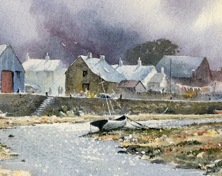
In this detail of a watercolour of the old harbour at Fishguard I made quite extensive use of masking fluid on the roofs and chimneys, the clothesline, steps and white highlights on the water. This allowed me to brush the sky wash vigorously across the paper and over the tops of the roofs, and later to apply the dark washes over the harbour wall and steps and the background to the clothesline without having to fiddle. The same applied to the sparkling water where I used cobalt blue.

I sometimes work round these features to create the negative shapes, but this can make the background appear overworked or splotchy, and take away the freshness. However, developing your skills at negative painting is invaluable, and is an excellent alternative to masking fluid. You will notice in this painting that there are tiny white features such as gulls, masts and ropes hanging from the harbour wall. These were rendered with white gouache, as I prefer this where the feature is so thin that masking fluid can appear clumsy. Gouache is also really effective for tidying up bits that haven’t quite worked.

I hope you all have a great festive season, and maybe Santa has left you an arty treat in your stocking to help get you going again with your painting. I shall try and snatch a few moments in the great outdoors with my paintbrushes. May you have much success with your painting in 2017

David Bellamy – Hand-bagged in Dubrovnik while painting

The sun beat down as I sat in a pleasant, shady spot beside Cavtat harbour demonstrating a watercolour, when Tarzan and Jane hove into view, both bronzed as they stood before us brazcavtat-harbourenly flexing their pectorals. Both were clad solely in thongs, otherwise naked and obligingly creating a combined landscape and life class all rolled into one. They moved round us, causing titters among the group, and at times my brush went distinctly wayward as I heaved with laughter at this incredible display of narcissistic clownery. Jane sat down in front of us, smiling like a Cheshire cat at the group, and presumably hoping someone would paint her.

This sort of distraction can un-nerve the alfresco artist, but the group chuckled valiantly and took it in their stride, producing some excellent work. Later in the week I demonstrated again in Dubrovnik, which unfortunately was so choked with cruise-ship tourists that there was hardly room to swing a sable, and as I painted I did get hand-bagged several times.

    So, it was with relief we sailed to the island of Sipan where I found a shady spot to demonstrate watercolour pencils. An old bicycle formed an excellent centre of interest – it was leaning against a wheelbarrow, which was leaning against the tree, so in the interests of simplicity I left out the barrow and about a million other equally exciting things lying around, to illustrate the need for keeping things simple. I faded out the buildings adjoining the old barn. The pencils were applied first in the various colours and then this was washed over with water, blending in the colours and then drawing into the wetness with a dark watercolour pencil where I wanted to emphasise details. If you feel your watercolours get a little out of control then try the watercolour pencils. This work was done on Bockingford 140-lb hot-pressed paper, an excellent surface for these pencils.

Our annual Watercolour Seminar is just about upon us, and this year we are back in The Settlement in Pontypool, a superb venue. It takes place on Saturday 1st October and there are still places left if you feel like coming along. The theme will be injecting mood and drama into a landscape and I will be using the exciting range of watercolours from Daniel Smith, demonstrating how to take advantage of these amazing colours and give your paintings some extra zip. As well as a demonstration I will be giving an illustrated talk on the same theme, covering a wide range of landscape subjects. Details of the seminar are on my website. We look forward to seeing you there.

David Bellamy – Using tonal effects to suggest mood and space

Injecting mood into a landscape painting not only makes the overall effect much more exciting, but can create a strong sense of space and distance in the work. Although this scene of Faversham Creek in Kent already had a feeling of great space I wanted to exaggerate the atmosphere even more in the finished painting.
I chose a blue-grey tinted paper for this watercolour and deliberately kept the distant wooded hillsides very faint in order to create a striking contrast with the foreground features. The strong tones on and around the buildings help to push the faint hills well into the background. If everything is given the same degree of tonal strength then it will be hard to distinguish various features from each other, even with contrasting colours. Masts, gulls and some white boats were rendered in white gouache, and I have only included the main part of the composition so that the distant hills can be seen better.

I shall be giving another of my annual seminars at the Settlement, Pontypool on Saturday 1st October, and it will be covering how to create mood and drama in a painting, beginning with a watercolour demonstration, and this will be followed by an illustrated talk on the subject, including a great many examples of different landscapes and coastal scenes. You can find details on my website http://www.davidbellamy.co.uk/seminar-pontypool-october-2016/  I shall be demonstrating the exciting Daniel Smith watercolours and Saunders Waterford paper, and there will be plenty of time for you to ask any questions, so I hope to see you there.

David Bellamy – Observing the Landscape

Learning to draw and observe properly are essential skills for the landscape artist in watercolour, and although most artists can see objects clearly, so many have appalling problems when trying to observe and record a scene. This is one of the fundamental skills I try to teach students on my painting courses, but it does take quite some application and determination to continue practising the skills once the course has ended.

This is a photograph of Skelwith Bridge, taken during my recent painting course in the Lake District. Whilst the lighting is a little flat, it is still pretty clear that the distant features viewed under the arch are a little darker in tone than the left-hand side of the bridge, though they are lighter than the underside of the arch to the right. Comparison of tones in this way is a vital method of working out these tonal relationships. Always think not just about the shapes before you, but the main tonal relationships as well. This will bring forward your art in leaps and bounds, and I would urge you to practice this with deliberate emphasis for at least the next month or so.

My rough sketch of the bridge on the right was done in about 12 to 15 minutes and this is the sort of drawing that will help you with your tones. Breaking away from a pure linear response to a subject is absolutely essential in your development as an artist.

I shall be demonstrating at the Patchings Art Festival  on Thursday 9th, Friday 10th and Saturday 11th June, in the St Cuthberts Mill Marquee, painting on the fabulous Saunders Waterford and Bockingford papers. Do come and chat. It’s always a great show with superb demonstrators, marvellous crafts, paintings and art materials. I will be painting with Daniel Smith watercolours and will have available the dot-card palette of the colours I mostly use in their range, so come along and pick one up.

David Bellamy – Quick sketching in watercolour

Don’t you wish sometimes that life could be really dull, drab and boring? It can get a little too exciting for much of the time, leaving you breathless and with no time to sit back and recall all the fun you’ve had. Being out on the hills tends to energise me and is far more pleasant than sitting in the studio, especially when you have to listen to the racket of builders across the road with their loud radios and screaming stone-cutters. And I usually take a cappuccino and Danish pastry out with me anyway – it’s amazing how it helps the washes flow across the paper!

When I went out recently on the Brecon Beacons, I took with me some small sample sheets of the new Saunders Waterford High-White hot-pressed paper from St Cuthberts Mill. It really is delightfully smooth and as one would expect with St Cuthberts, it takes the washes well. As you can see in the rough sketch, the snow really does stand out on this paper. Note how the terracing of the rock outcrops appears in broken horizontal lines, with a few gullies sweeping down here and there. It’s important to spend a few moments observing these aspects as they give a marvellous sense of place in your work. This paper also works well for wash and line work, and should be in the art shops fairly soon. I can’t wait to work on some big sheets.

I shall be demonstrating at  Patchings Art Festival next month in the St Cuthberts Mill marquee, on the 9th, 10th and 11th June, so I hope you can come along and enjoy the event. It’s always a great pleasure to be there, with so many artists and crafts-people, and of course, all the materials to check out. And make sure you try out some of the Waterford HP paper!