
Whether you go out sketching to find subjects to paint back home, or perhaps to record days out in a sketching journal, or simply for the joy of being out enjoying sketching, there is no doubt that the value of this activity stretches well beyond just the artistic side. For me sketching is calming, and like nature, helps to reduce the stresses of life. I often sketch just for the joy of it, without any thought of working up a painting from the experience, and find that diving into old sketchbooks brings so many happy memories flooding back.
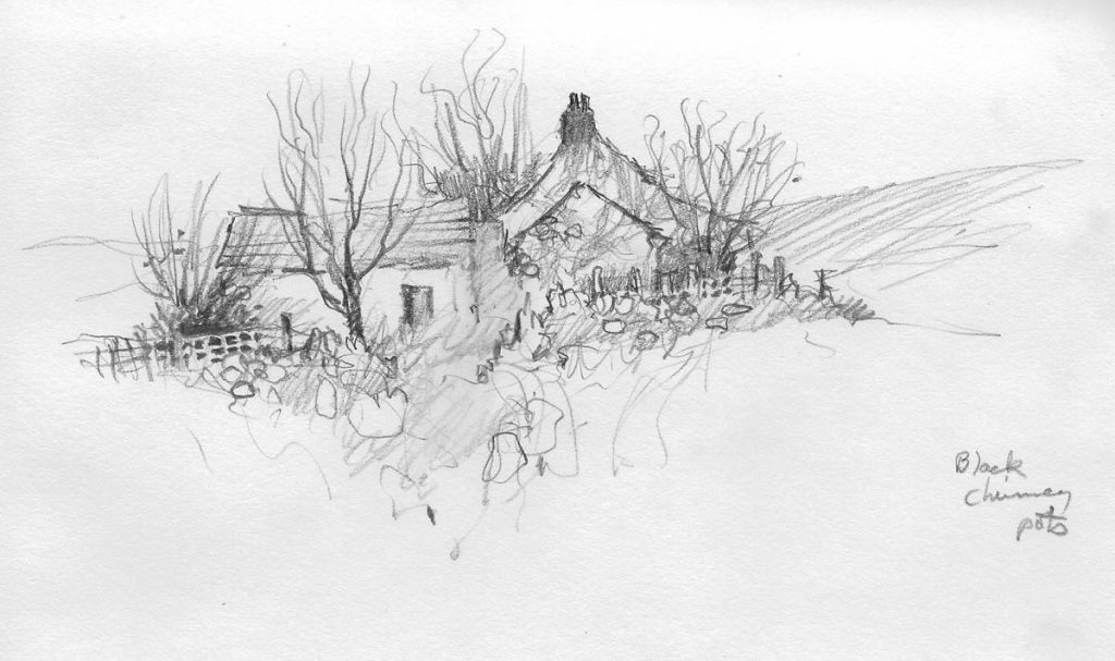
This pencil sketch was done on a December day on Dartmoor, a place I have always loved. I’ve only made on colour note, and that’s about the chimney pots being black, a rather unusual colour. In the centre of the buildings is a rather confused area, the sort of things we often find when we want to do a painting of the scene back home. It can be very annoying when you have a stunning subject to paint and there’s an annoying omission, and especially when it’s bang in the centre of the composition.
Here the problem is fairly easy to overcome: I could simply lose the apparent gap and join the buildings together, or hide it behind a bush, a figure, or another feature. However, one remedy I regularly use is to introduce a little bit of artistic obfuscation, which has the advantage of simplifying matters. I swipe across a wash of colour without attempting to add in any detail whatsoever. I also use the technique to substitute an ungly feature with the wash, sometimes dropping in a second colour for variety.
Erwood Station Gallery & Craft Centre near Builth Wells is now open after a short break, and they are organising an Amateur Portrait Artist of the Year 2024 competition over the summer months, to promote the arts, give amateur artists an opportunity to be seen and showcase how the arts can help people in their mental health. The first round takes place on Saturday April 6th. If you don’t feel up to participating just come along and watch, and maybe pick up a few tips. You can obtain information from Stacey on 01982 560555 or email her at erwoodstation@hotmail.com
