I’m afraid things have been quiet on the blogging front lately as I’ve been in the Canadian Rockies for the past few weeks, painting some truly stunning scenery, and this will be the subject of a forthcoming blog.
This post covers the tricky subject of how you rescue watercolours that have gone slightly awry, or perhaps have somehow spectacularly misfired. It happens to us all. Many folk think you have to tear up the wayward masterpiece, but many watercolours can be effectively rescued even when they appear to be something of a disaster. I’ve just produced a DVD on the subject, and this covers a whole variety of techniques you can use to put things right, or simply alter a composition where you feel the need for change.
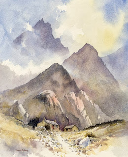
On the left you see one of my old watercolours that I discarded years ago as I didn’t like the finished treatment: the peaks were too repetitive, the edges too hard, and the atmosphere didn’t really convince me. I felt I’d made a mess of it. When I was persuaded to do a rescues DVD I thought this would be a good lesson for illustrating methods of changing a scene.
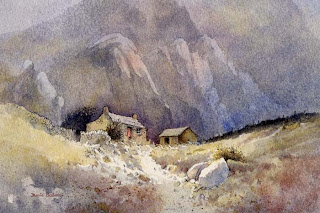
Unlike a recent painting, over time it becomes more difficult to sponge out details and passages, but I have the advantage that most of my watercolours are carried out on Saunders Waterford paper, one of the most robust watercolour papers on the market, so I could really work hard into the paper. I also rarely use the manufacturers’ greens, preferring to mix my own, which are less staining and therefore easier to remove. Because of the hard-edged striking shapes of the peaks in this painting I realised that I would have to completely change the format to a landscape one and not include those strident peaks.
My first task was to reduce the background by heavy sponging with plenty of clean water, then subduing it further with a transparent glaze of French ultramarine and a little cadmium red. This had the effect of creating a misty distance, cooler in temperature. By placing some shadow across the foreground it emphasised a lighter patch in front of the bothy, and while this was still wet I dropped in some Indian red to warm up the immediate foreground. Thus, the cool background and warm foreground suggested greater space and distance, and the buildings stand out more.
Copies of the Rescue Watercolours DVD, available for the first time this month, are available from my website If you have any old watercolours lying around that haven’t quite worked, or have encountered a mistake you’d like to rectify, then there are many techniques on the DVD which will help improve your work. Some of the techniques are also useful to employ as a deliberate method to create special effects. There is nothing worse than finishing a watercolour only to find there is a niggling little problem to which your eye is drawn time and time again, when in fact there are almost certainly ways of solving the issue.


