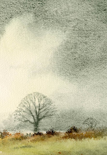
Experimenting

Twilight Cottage

In order to develop our painting skills, it is a good idea to experiment from time to time, Often this starts with just making a bit of a mess. A while ago I wanted to try using Mixed Media on the sandpaper, Fisher 400 Artpaper, that I love to use for my pastel paintings, as I was aware that it was waterproof, unlike the industrial sandpaper that I used before Fisher 400 was produced.

This painting of Twilight Cottage, started with an ink outline of the building, followed by a watercolour wash of Naples Yellow and Ultramarine in the sky and Cadmium Orange and Cadmium Yellow in the foreground. I let this all mingle and some of the ink drawing ran into the washes.

At first I thought that this was a mistake but when it was dry the dirtyness of the cottage appealed to me and also suggested a low light. So I worked into the painting with pastel, leaving large areas of the watercolour washes showing and added some undergrowth in the foreground with the scraping technique, which involves scraping flakes of pastel onto the painting and pressing them into the surface with a palette knife. This creates a spatter which resembles flowers or seed heads.

You can read how to create the scraping technique in my book, and you can see it demonstrated in film on my DVD,. The book and dvd are entitled Painting with Pastel and are on special offer our website.

Creating space & distance in landscape paintings

One aspect of landscape painting that causes a few problems for the less experienced artist is that of suggesting a sense of space and distance. This is especially a problem where the air is clear and you can see everything in outstanding detail for miles, thus tempting us to put everything into the composition, in quite strong detail. We usually need to create something of an atmospheric haze, sometimes within a short distance, in order to create a feeling of depth and space in a painting.

The key to creating a feeling of distance in a landscape painting is to ensure that the more distant feature has less detail, less colour strength and less tonal strength than that which it is in front of that feature. In this small part of a watercolour you can see that the left-hand mountain slope is quite a bit stronger in tone and detail than the ridge disappearing behind it, and this applies to trees, buildings and all manner of features. Make sure that there is very little detail in the more distant feature as it goes behind the closer one, otherwise this will confuse matters.

The above picture is part of my painting of Glen Feshie, in the Cairngorms of the Scottish Highlands, and is currently on display in my exhibition at Lincoln Joyce Fine Art, at 40 Church Road, Great Bookham, Surrey. Telephone 01372 458481, which continues until the 22nd October

Granulating Watercolours

I’ve always loved colours that granulate – that is, create a varied speckling across the wash which had traditionally been present in certain pigments such as French ultramarine and cobalt blue, for instance. This summer, my attention was drawn to the Daniel Smith watercolours which are imported from America, as so many of the colours in an extraordinarily large range tend to granulate.

In this small section of a watercolour painting you can clearly see the strong granulating effect in the sky area. This colour is Zoisite Genuine, a grey-green that is especially useful for mixing subtle greens by adding one of the yellows to the mixture. It also has a slight tendency to intermittent sparkle when caught in a certain light, and is excellent for those areas you wish to play down, yet retain a little interest in the form of the granulations.

Moonglow is another colour that granulates well, a deep violet that would be ideal if you need a ‘mysterious dark’ with a little warmth. Whilst it may be an exciting addition to your halloween paintings, it could inject some lovely moody atmosphere into your landscapes, and I look forward to experimenting further with it.

Another exciting colour is Quinacridone Deep Gold which can impart a glorious rich glow to your skies, autumn scenes, or many other applications in a painting, and if you want intensely blue summer skies the Daniel Smith Manganese Blue is a knock-out. I should also point out to those who like Yellow Ochre, but not its opacity, that in this range the pigment is transparent!

I’ve only tried a few of the colours in this range, but from what I’ve seen they do give exciting possibilities. As artists we should always be on the look-out for new colours to try out. You can buy test sheets of the whole range and these contain a small blob of colour of each pigment that you can try out. Many of the colours are metallic, they shimmer and sparkle, so not all are suitable for traditional watercolour painting, but if you wish to look further see http://www.premiumartbrands.com

Exhibition of watercolour paintings

Wednesday 5th October sees the start of my major 2011 exhibition, From Mountains to the Sea, at Lincoln Joyce Fine Art in Great Bookham, Surrey. The subjects range from coastal scenes, rural landscapes to the high mountains, with a number of overseas locations included. Naturally the mood of a place is a strong feature in each watercolour, as has always been one of my prime aims in depicting the landscape.

One of the paintings is this view of a farm in Upper Langdale in the Lake District, the tops dusted with a thin layer of snow which strongly contrasts the red of the dead bracken on the mountainside. This was painted from a sketch I carried out many years ago, for I have so many sketches and photographs that I can quite happily put many good ones aside for some time until I feel the moment is right. The only thing that was not actually present when I did the sketch is the group of chickens – these were taken from another source, and it pays to have secondary visual resources like this to beef up a composition, however good the original may be.

The exhibition runs until 22nd October and Lincoln Joyce Fine Art can be found at 40 Church Road, Great Bookham, Surrey, KT23 3PW, telephone 01372 458481 I shall be there on Wednesday 5th October to conduct the watercolour seminar in the hall opposite. We still have a few places left if you’d like to join us for the demonstration and talk on Skies, Light & Atmosphere, in which case it is advisable to ring the gallery (above) and ask for a ticket to be kept aside for you to pick up on the day. For details see http://www.davidbellamy.co.uk/

Pan Pastels

Recently, I’ve been experimenting with the new Pan Pastels made by a US company. They come in flat cakes, and are applied with sponges. The finely ground pigment creates vivid colours and soft, subtle nuances of tone. Blending is easy with the various shaped sponges and Sofft ™ tools which come in a range of different shapes and sizes.

You can combine the Pan Pastels with pastel pencils for the fine detail and the use of colour shapers, especially the flat chisels allows you to sharpen endges. If you like painting pastels onto sandpaper, as I do, you will find that the use of the sponges for applying and blending the colours avoids the problem of damaging your fingers of the abrasive surface of the sandpaper.

You also use a lot less pastel and there very little dust. I am delighted with the way this new form of pastel paint forces me to use new techniques and develop my style in a new and exciting direction.

Visit the Pan Pastel website to find out more and visit their facebook page, where you will find more of my work in pan pastels displayed. Comments welcome