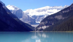
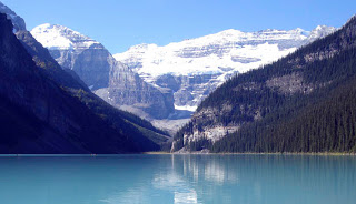
The Secret of Speckles

I’ve been asked many times how I get the fine speckles of colour in my paintings so I am going to let you into the secret. I lay the painting flat on a table and using the edge of a palette knife I scrape flakes of pastel on the surface where I want to create the effect of small leaves, seed heads in a field or sea spray on rocks etc. I than press the flakes into the painting with the flat of the palette knife. If there are some stray flakes which you do not want, you simply don’t press them in and they will either fall off when you place the painting in a vertical position or you can blow them away.

Scraping

Step 2. Press the flakes into the surface of the painting with the flat of the palette knife where you want them to stick. Blow away any unwanted flecks.

Pressing in Speckles

Step 1. Lay the painting horizontal on a table and using the edge of a palette knife, scrape flakes of pastel from a pastel stick on to the surface of the painting where you want to create fine specks of colour.

__________________________
This technique is most effective if you use contrasting tones and colour.

It is almost impossible to achieve these fine marks with a dotting technique and the random effect is particularly pleasing.  However, I will issue one word of warning. This technique is addictive and it is easy to get carried away using it all over the place and then the effect is spoiled.This technique is described in my book Painting with Pastels and demonstrated on my DVD of the same name. Or you can buy both at a Special Offer Price of £20.

Painting complicated mountain scenery

Canadian Lake

Canadian Lake

Even experienced professionals can get overwhelmed when confronted by the mass of panoramic detail found in the high mountains. Where do you start? What do you leave out – as you can’t possibly put it all in? This is especially a problem in really good visibility, when there is not a cloud in sight. As if this wasn’t enough, some of the most spectacular places are so beautifully composed that it is all done for you, and it is easy to think that all you need do is copy the composition in front of you.

This picture-postcard view is in the Canadian Rockies where we will be going in September. Everything stands out beautifully, but in a painting you need some mystery with part of the motif just hinted at. One device for working out the best composition in front of you is a simple card rectangle with an oblong hole cut out so that you can view the scene you want. Hold it up before your eyes, closing one, and moving the card frame around until you light on the most exciting part of the scene. You may need to move it towards you, or away from you to achieve the optimum size, but this will certainly help you to isolate the scene.

Where ridges pass behind a closer feature you can reduce the detail, perhaps bringing in some cloud or mist at this point, or even a snow squall. In this scene the centre of interest could well be the ‘V’ where the two dark ridges descend in the centre to the lake, but it would be a good idea to push this either to right or left a little, so that it’s not plumb centre. A hint of red or orange there might be a nice touch, and you could also use this in the reflection. The far shoreline cuts right across the picture, a common problem, but easily fixed with some foreground trees or other features.

If you like this type of landscape then why not join Jenny and myself in the Canadian Rockies from 1st to 14th September? I shall be covering all manner of techniques for painting these scenes in watercolour, but painters in other mediums are welcome. The painting holiday is organised by Spencer Scott Travel Telephone +44 (0)1825 714311 or Email:  info@spencerscott.co.uk

Painting Rocks in Pastel

One of the most common problems people encounter when painting landscapes is how to portray a realistic looking rock. It is mainly a matter of light and shade but colour is also an important element. Rocks are rarely one uniform colour and although sometimes the colour range is limited, subtle changes from one tint to another are very effective.

In the above image, which is an enlarged part of a painting that I am currently working on for an exhibition in Tenby this spring, the strong light increases the contrast between different planes making it easy to make the rocks look three dimensional. The light faces are defined with a soft transistion of lighter tones and some darker fracture lines, rendered with a sharp charcoal pencil.

It is also important to study the random shapes of rocks. If you make all your rocks the same size and shape and uniformly spaced they will look man-made rather than natural. Of course the best way to improve your rocks is to go out sketching and make some careful studies. Or, if rocks are conspicuous by their absence where you live, gather a pile of randomly shaped stones and make a detailed pencil study in your studio. Even this should help you to understand the play of light and shade and the random nature of their shapes.

If you want to join me on my painting course in Lynmouth, North Devon in May I will be sketching and painting rocks, cottages, trees and water. North Devon has some beautiful scenery and we shall be well looked after by Cheddar Painting Holidays

Painting Landscapes in Pastel

Autumn in the Clydach Gorge

Autumn in the Clydach Gorge by Jenny Keal

Although I work in watercolour, I do some painting in other mediums, one of which is pastel. I have neglected it for many years and keep promising myself to do some more, especially when I see what Jenny is producing these days. If you find watercolour difficult, or maybe you are in a rut at the moment, why not try pastels? They make a wonderful change, and you can always return to watercolour later. Many artists find pastel painting so much easier, but some don’t like the dust and mess on their fingers.

Jenny has excellent ways of managing pastel dust and the mess on your fingers, and she is only too willing to show you her methods. She has superb techniques for creating areas of tranquil water with reflections and sparkling highlights. On the right you see one of her paintings of the Clydach Gorge with reflections in deep water. Pastel, with its rich colours, is excellent for autumnal scenes, which can at times be tricky in watercolour, especially when you want to juxtapose light yellow or orange foliage against a darker background. The medium is also much more forgiving – you can alter features fairly easily compared to watercolour. Pastel is also great for fading away the more distant features, as you can see here.

One of my favourite subjects is rocks, and I’ve just seen Jenny’s latest works on rocks, and they certainly have the WOW! factor. Check out Jenny’s blog where she gives free tips, but if you’d really like to give pastels a try why not enroll for her course in Lynmouth from 20th to 23rd May, when she’ll be showing students how to paint the stunning coast and countryside of North Devon?

Painting less for more effect

Cotswold Cottage

Cotswold Cottage

One of the most thorny problems confronting the painting tutor is putting across the need to eliminate unwanted detail from a subject when the student has already been told to work directly from the subject and produce a careful rendering of the scene. As landscape artists we go out into the countryside to seek out visual material to work from and use as a basis for a composition, yet in order to produce an interesting painting we need to filter out a lot of extraneous detail. I am not interested in producing a photographic response to a scene where everything is laid out meticulously.
In this view of a cottage you will see that certain edges have been lost – there is no defining line for the bottom of either the house wall or the drystone wall, as this approach provides a more painterly response, rather than a photographic one. Also the stones are only described in a minimalistic way. In both these cases the eye of the viewer will subconsciously include these elements. An effective method here is to splash in a different colour in lieu of detail – note the patch of red to the left of centre. This can be a useful device even if the colour you apply does not appear in the scene, as it can both enliven a subject and avoid the need for too much detail.

For these stones I used a number one rigger brush – a very fine instrument with long hairs, ideal for fine work. Where I describe a number of stones in a wall I tend to ease off on the pressure where I want the stones to become lost, but another method I employ is to draw in a few more stones than I actually need, again with the rigger. Whilst these are still wet I then wash over the edge of the painted stones with one of the colours found in the wall, thus losing some of the stones at the edges, and at the same time creating a gradual losing of the detail that can appear more natural. An interesting exercise you can do is to paint the same scene twice: once in extremely strong detail all over the composition, and then again in the manner I’ve described above. By comparing the two results you will learn much about restricting the urge to include everything in a painting.