Jenny Keal – Sketchbooks

sketchbooks 001

Here is just a fraction of David’s many sketchbooks

I recently had an email inquiring about which sketchbooks I recommend. I thought other artists would find this useful too, so I am sharing this information here.

David and I both have a large collections of sketchbooks, The UK ones are dedicated to certain counties, or regions such as Mid Wales, Lake District, Yorkshire etc. and the overseas ones are illustrated daily journals of the trip, with text and drawings and paintings.

egypt sb

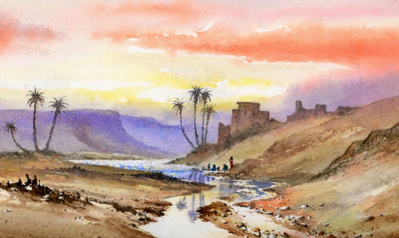
A page from my Egypt sketchbook

We have used a number of different brands over the years, some of which are no longer available but the ones we currently use are Daler Rowney Ebony Hardback Sketchbooks  in either A5 or A4 sizes. Many of the UK ones and all of the overseas ones are in casebound hardback sketchbooks with cartridge paper, either A4 or A5. Casebound books are more durable than ring bound ones and have the advantage that you can write on the spine and then organise them on a bookshelf.

crete sb

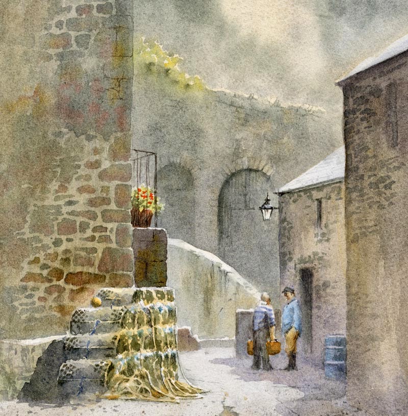
A page from my Crete sketchbook

 The other advantage of a casebound book is that you can extend the sketch over a double page spread and with an A4 sketchbook that means you have an area A3 in size. The paper weight is also important if you intend to use watercolour in your sketches. I would say that 150 gsm cartridge paper is the minimum weight to look for. There are a number of casebound sketchbooks coming onto the market and not always in art shops, some stationery shops now seem to stock plain cartridge paper casebound books. but check the paper weight carefully before you buy.
David and I strongly believe that sketching out of doors is the best way to improve your artwork, and if you paint in watercolour then sketching in watercolour out of doors is a truly liberating and exciting experience and will almost certainly improve your studio watercolours.
I hope you can discover the pleasure of working out of doors in front of nature.

David Bellamy – Painting Alpine scenery in Switzerland

Some of the best painting holidays where we have taken groups have been those which combine spectacular scenery with the more rustic, and this is usually very true of mountain landscapes. Next summer Jenny and I are taking a group to Zermatt in Switzerland, not just to paint mountain icons like the Matterhorn and the Obergabelhorn, but many other peaks, as well as lakes, mountain streams and the local vernacular architecture. The region is full of exciting prospects for the artist.

The watercolour shows a pair of stadel barns above Zermatt – these make excellent subjects, especially when set against a backdrop of Alpine peaks. The roofs in this instance particularly interested me with their strong textural variations and colour. It is always good to look for colour in a scene and I often exaggerate warm colours on a focal point such as this, both to reduce the amount of greenery (which can overwhelm a landscape in summer), and to draw the eye towards the centre of interest.

Note that the greens in the painting are not really intense greens – the summer grassy pasture is a light, but subdued green, while much of the conifers greenery is more a blue-grey, achieved with French Ultramarine and burnt umber. You don’t have to make the green trees in front of you green!

Our painting holiday to Zermatt is in conjunction with Leisure Painter and The Artist magazines, and is being organised by Spencer Scott Travel  Tel. 01825 714311   The holiday runs from 4th to 11th July 2015

With all that amazing Alpine scenery it’s a truly exciting prospect.

David Bellamy – Painting desert and tropical scenes in watercolour

I was asked recently about painting tropical scenes and how this differed from my usual British landscapes. Although I haven’t done any tropical work for a while, over the years I’ve painted quite a number of scenes in the tropics, especially in East Africa with its wide range of spectacular scenery. Desert scenery is one of my favourite genres, as the figures and colours can be quite exotic, and one tends not to find the painting water freezing up, as in more northerly climes. Unfortunately I don’t have any record of earlier jungle and tropical plant scenery paintings, so this is the closest I can find, until I manage to paint further tropical scenes, which probably won’t happen until next winter.

This watercolour shows a wadi in the Atlas Mountains of Morocco towards evening, with women washing clothes in the river. We were returning from an expedition when I spotted this marvellous composition, and did a quick pencil sketch of it, even though I felt pretty tired and was likely to be assailed by hundreds of kids demanding pencils.

I take much the same colours with me to the hotter climates, as I do in Europe, but tend to use more of the brighter colours. This watercolour was done on Saunders Waterford 140lb hot-pressed paper which is excellent for bringing out the vitality of the brighter colours, really making them sing. I used vermilion in the sky, with gamboge in the brighter parts. As with most landscape work it helps to suggest space and distance with cooler colours in the more distant passages, and this can also throw the emphasis on to those areas of brighter colours, whether lush vegetation or other features. Here I used French ultramarine for the background. You can create really striking colour effects by juxtaposing complementary colours, for example bright red flowers or plants set in vivid green foliage. I hope these tips will help those of you who like more exotic scenery………..until I can get back into the jungle.

David Bellamy – Creating the effect of old stone walls

Writing blogs on a steam-driven laptop is an extremely slow process, and with extremely poor internet connections it can take me hours, which is the reason I’ve slowed down the number of blogs I do. Technology in Wales seems to be in some sort of reverse decline, and once the black-outs start hitting us it will be even worse. Progress is a funny thing!

Jenny and I enjoyed Patchings Art Festival, where I did two demonstrations in the St Cuthberts marquee to large, enthusiastic audiences. It’s always a joy to work with St Cuthberts Mill, and the Saunders Waterford High-White paper is superb for getting the best out of your watercolours.

I’ve just taken some new watercolours to Art Matters in White Lion Street in Tenby (Tel. 01834 843375) and this is one, showing a quiet corner of Tenby harbour. The lovely old stone walls provide an interesting backdrop, and these were done by laying an initial wash of Naples yellow over the entire area, and once this was dry painting in the stonework with cobalt blue plus cadmium red, to which I added a few drops of yellow ochre while the stones were still wet. I left some of the Naples yellow showing as light-coloured mortar between the stones. Once again I waited until the whole area had dried and then glazed it all with a weaker wash of cobalt blue and cadmium red. This both imparted a greater sense of unity and slightly softened off the edges of the stonework.

The background has been considerably simplified so that the emphasis is thrown onto the figures in conversation, and the surface was Waterford 140lb NOT, which is excellent for taking repeated washes if necessary.

David Bellamy – Highlighting a landscape feature with a glaze

Some of you asked if I would show the full image of the promontory watercolour published on the post on 5th May, so here it is – the scene is in the central Highlands of Scotland, easily seen from the roadside as you approach Rannoch Moor to the north.

As you can see, I’ve positioned the lightest part of the composition behind the row of Caledonian pines on the further promontory, to give them more emphasis. The more shadowy parts of the background mountains were achieved by washing a mixture of French ultramarine and cadmium red over those parts which had already been painted. This was done with a large wash brush and quite a weak mixture, creating a thin transparent glaze across those areas I wanted to subdue, and thus emphasising the light section.

The painting is part of the exhibition at the John Muir Trust centre in Pitlochry (Tel.01796 470080) which I should point out ends on the 11th June, not 18th as previously announced. This is due to a mix-up, and I hope no-one will be inconvenienced.

Next week Jenny and I will be at the annual Patchings Art Festival in Calverton, just north of Nottingham, where I’ll be demonstrating for St Cuthberts Mill on the mornings of Thursday 5th and Friday 6th June. St Cuthberts Mill make the marvellous Saunders Waterford and Bockingford papers that are such favourites with amateur and professional painters alike. Do come along and say hello.

On the 20th and 21st June Jenny and I will be demonstrating at the Sandpiper Studio on the Wirral in Cheshire. Jenny will be demonstrating pastel painting on the afternoon of Friday 20th and I shall be demonstrating in watercolour on the Saturday morning and giving an illustrated talk on how to rescue watercolours that have gone astray, after lunch. You can find out more about these events from Julie McLean on 07788 412480 or email her at:  info@thesandpiperstudio.co.uk