Painting less for more effect

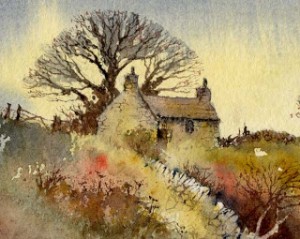
Cotswold Cottage

Cotswold Cottage

One of the most thorny problems confronting the painting tutor is putting across the need to eliminate unwanted detail from a subject when the student has already been told to work directly from the subject and produce a careful rendering of the scene. As landscape artists we go out into the countryside to seek out visual material to work from and use as a basis for a composition, yet in order to produce an interesting painting we need to filter out a lot of extraneous detail. I am not interested in producing a photographic response to a scene where everything is laid out meticulously.
In this view of a cottage you will see that certain edges have been lost – there is no defining line for the bottom of either the house wall or the drystone wall, as this approach provides a more painterly response, rather than a photographic one. Also the stones are only described in a minimalistic way. In both these cases the eye of the viewer will subconsciously include these elements. An effective method here is to splash in a different colour in lieu of detail – note the patch of red to the left of centre. This can be a useful device even if the colour you apply does not appear in the scene, as it can both enliven a subject and avoid the need for too much detail.

For these stones I used a number one rigger brush – a very fine instrument with long hairs, ideal for fine work. Where I describe a number of stones in a wall I tend to ease off on the pressure where I want the stones to become lost, but another method I employ is to draw in a few more stones than I actually need, again with the rigger. Whilst these are still wet I then wash over the edge of the painted stones with one of the colours found in the wall, thus losing some of the stones at the edges, and at the same time creating a gradual losing of the detail that can appear more natural. An interesting exercise you can do is to paint the same scene twice: once in extremely strong detail all over the composition, and then again in the manner I’ve described above. By comparing the two results you will learn much about restricting the urge to include everything in a painting.

More Pan Pastels – Monument Valley

This is another painting that I did with Pan Pastel. This time I used a sheet of white Clairefontaine Pastel Mat paper. This paper has a good tooth which is not quite so ‘sharp’ as sandpaper.

The challenge this time was the warm colour of the distant features, especially the right hand mitten, which would make creating a sense of recession quite difficult. When the painting was almost finished the colours of the two ‘mittens’ was very similar so I loaded the oval sponge with a light coating of white pan pastel and patted it gently over the distant ‘butte’ to push it into the distance.

My family and I travelled to Monument Valley earlier this year to celebrate my 60th birthday. Since a child I have loved cowboy films and many of them were filmed in this very special scenery. To fulfill one of my lifetime ambitions, we hired horses and went riding through the buttes with a Navajo guide. We also went to the Grand Canyon, Bryce Canyon and Mesa Verde, so we ticked off several more of my amibitions whilst we were there.

Painting a waterfall in pastel

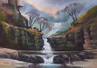
Scwd Isaf Clyn Gwyn

Scwy Isaf Clyn Gwyn, Pastel by Jenny Keal

If you have tried painting water in watercolour you will know how difficult it is to work negatively around the white paper to create the highlights or how tricky it is to lay the wet in wet reflections at just the right time.

Painting water in pastel is much simpler because you can lay the light over the dark. This means you can create far more intricate and subtle effects in the falling water and reflections can be created by softening the pastel in a vertical direction with your fingers.

This painting is of Scwd Isaf Clyn Gwyn, just south of the Brecon Beacons in ‘waterfall country’ around Ystradfelte. It is a spectular series of falls in a Tolkeinesque gorge. The painting was built up in stages, keeping the background fall soft and misty to convey a sense of distance. The warmer colours, stronger tones and sharper detail in the foreground emphasise this effect.

You can see this painting, along with many others at The Wyeside Art Centre in Builth Wells. as David and I have an exhibition on there for the rest of the summer. Contact them for opening times

Please use the comments box if you have any specific questions about how the painting was created.