DAVID BELLAMY HAPPY CHRISTMAS

I don’t know about you, but I find December is always a mad and chaotic rush around trying to keep normal life and business functioning while coping with the extra tasks of Christmas. I’ve just returned from town whtere I found the toy shop far more interesting for buying presents than the adult ones!

This scene I came across while stumbling through the snow-bound woods near the Bachhowy River a short distance from home. That was a long time ago and the cottage was abandoned, but to give it a sense of life I added rising smoke. The sky is mainly quinacridone Sienna and moonglow, with some touches of French ultramarine. I used masking fluid to reserve the snow-laden branches. The scene was more or less as I have created it, complete with puddle in the foreground, although I have changed the sky considerably.

I shall be enjoying a far from relaxing Christmas in the company of my rather energetic little grand-daughters in Pembrokeshire, but I’m sure we’ll have a great time, and I wish you all a very Happy Christmas and good health and much success with your creative activities in the New Year.

David Bellamy – Greys in watercolour landscapes

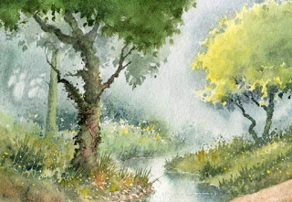
For the landscape painter grey is an extremely useful colour, often to set the mood, or equally importantly to provide a passage of quiet dullness that can be vital to make those exciting vibrant and perhaps bright colours stand out. In this scene of a stream in the New Forest, painted on Waterford NOT 140lb paper, I have used the superb Daniel Smith Lunar Blue to create the background, an exciting blue-grey colour that has interesting characteristics that may not at first sight be apparent. At it’s full strength as you can see on either side of the main tree-trunk where it defines the tops of the grasses, it reveals a powerful granulation, yet on the right-hand side where I have simply laid a weak wash of the same colour, there is no granulation. The stronger tone used, the more prominent become the granulations.

Daniel Smith have introduced a number of useful new greys into their collection recently and I’ve been trying out some of them. Alvaro’s Caliente grey is a lovely, warm grey which is quite dark at full strength, and is excellent for creating moody landscape backgrounds. The cooler Alvaro’s Fresco grey can inject a feeling of drama into a composition, for example if you may like to portray a cold sea or stormy sky, or simply cool shadows. The third grey I tried was Joseph Z’s neutral grey, a versatile colour that will be a welcome addition to the landscapist’s palette, again for creating moody scenes. All these greys can of course be modified by mixing, but one great advantage of these Daniel Smith greys is that the artist will already have a selection of interesting and varied greys without having to do any prior mixing, and in each case above the colours can produce a wide variety of  tonal values.

 I shall be demonstrating next Thursday, Friday and Saturday at the marvellous Patchings Art Festival, in the St Cuthberts Mill marquee, using the superb Saunders Waterford and Bockingford papers. Our stand will be beside the marquee so do come and chat and learn more about these excellent products and see other examples after the demonstrations. I will also be signing copies of my new book, David Bellamy’s Seas & Shorelines in Watercolour, just published by Search Press and is the No.1 Landscape painting best-seller on Amazon. You can obtain signed copies from my website  I hope to see you at Patchings

David Bellamy – Adding a sense of mystery to a waterfall painting

Waterfalls are popular subjects in a painting, and I’ve had a great many exciting moments sketching them, climbing them and abseiling down them, including ones underground where they really give you that “Hey-ho, here we go, but what’s at the bottom?” sort of feeling. Having the Brecon Beacons close by is an added bonus as there are more waterfalls per square inch there than anywhere else in the country.

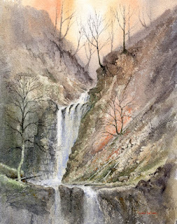
    It is fairly easy to find waterfalls as they are usually marked on walkers’ maps, and if they have a name then you can Google them to get access information and a pretty good idea of what you can expect as descriptions are often accompanied by photographs. In this watercolour I used the excellent Saunders Waterford 300lb rough paper and increased the roughness even further in places where more rock textures were to appear by glueing thin Oriental papers in place.

My aim was to create a sense of mystery in the background using the wet-into-wet technique to blend the furthest rock and tree shapes into the misty background, then when this was dry painting harder shapes to suggest distance. The upper falls emerges from out of this atmospheric backdrop and for the falling water I leave the paper untouched so that it stands out in strong contrast to the darker sides, and especially the hard-edged rocks jutting out.

I shall be demonstrating waterfalls in watercolour at the Sandpiper Studio at Ledsham on the Wirral at the end of the month. As the first demonstration was so popular and filled up quickly, we have added another on Friday 28th October from 2pm to 4.30pm, and there are still a few places left on this one. Further details and bookings can be obtained from Julie McLean on 07788 412480  or Email her on iinfo@thesandpiperstudio.co.uk The two demonstrations will be of different waterfalls, and if you have lots of questions then bring them along! I will also be using the Daniel Smith watercolour range with their exciting colours. No abseiling is involved.

David Bellamy – The negative painting technique in watercolour

This weekend we had our annual watercolour seminar in Pontypool, and as usual we had a very enthusiastic audience. It’s always good when lots of questions are forthcoming and people create a real buzz with their obvious excitement about indulging in watercolour painting and learning new techniques. When they can see the techniques being demonstrated close-up on the screen it really fires them up.

One of the techniques I was questioned about this weekend was that of the negative painting method. In watercolour, because it is a transparent medium and we cannot effectively paint a light colour over a dark one, we need to resort to other ways of working. We can use masking fluid, which reserves the white paper, but can be clumsy at times. Another method is to rub a candle across the paper to form a resist, but this is hopeless if you need intricate detail. A third technique is to paint gouache or acrylic over the dark area, but here the opaque paint can appear intrusive often losing that lovely sense of watercolour transparency and spontaneity.

The picture shows part of a painting mainly completed out of doors. It reveals a number of negative painting examples: the trunk and branches of the birch tree; the right-hand boulder; where the dead bracken stands out against the dark background; and the edges of the falling and turbulent water. The sole method I have used here for each of these examples is to work round each feature with a darker colour. In the case of the red bracken, this was painted on first, allowed to dry, and then the dark background wash brought down to describe the birch tree, the boulder, the water and of course, the red bracken.

This techniques is extremely effective and well worth learning. I don’t normally put quite so much negative work into one painting, but this was meant as an illustration on how to apply it, and can be seen on my Painting Winter Landscapes DVD, which accompanies the book with the same title. For more information see my website or that of APV Films who produced the film.

Woodland magic

One day recently I planned a walk, and arriving at the start point I was about to set off when I heard the sound of falling water in the opposite direction. When I investigated the falling water it failed to interest me, but beyond it I could see a lovely woodland scene with a river gliding serenely amidst the pinewood. I forgot my original walk and followed the stream as it meandered along through the sunlit-dappled wood. Normally I can pinpoint likely spots of interest as an artist, but this took me by surprise, rather like entering the magical kingdom of Narnia.

Mossy banks, sunlit glades and artistically-placed fallen trunks added to the visual delight. I crossed a makeshift bridge and continued, photographing and sketching. The pines stood not in regimented rows, but as though placed by some great artist. Soon they gave way to a deciduous woodland, the stream became a more lively companion, tumbling and sparkling.

I sat on a mossy bump and ate my lunch, sketching at the same time the scene shown on the right. I also photographed it about 20 times, zooming in and out and trying different exposures. The results gave quite a startling variety of tones and even colours, driving home the lesson that these days, with digital cameras, it is worth taking loads of shots, trying to slightly change position, exposure and length of zoom with each one.

Looking at the scene here, the two bottom corners disturb me in that they are lit up, thus drawing the eye away from the centre, so I would subdue them with a dark wash, probably highlighting the right-hand ferns closer to the centre. Several of the trees also need subduing and simplifying, otherwise it becomes overwhelmingly detailed.

These landscape surprises are typical in Wales, and we shall be seeking out more in Pembrokeshire next month during my course in St Davids  There are still a few vacancies on the course.