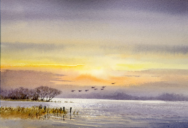
With winter upon us in the UK it is tempting to stay in and curl up in front of the fire with your watercolours, yet there are some lovely days out there when at times, like yesterday afternoon, it was perfect for watercolour sketching outside in the sunshine. What do we do, though, if we’re caught outdoors when it begins to snow or rain halfway through our watercolour?

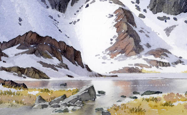
I always carry around with me a number of Derwent Watercolour Pencils, mainly the darker ones: black, indigo, various greys and a brown or two, and I use these superb pencils to draw into wet washes of watercolour. With this technique I rarely draw an initial outline, simply going straight in with the washes as on this watercolour sketch on the left of Festvagtinden in the Lofoten Islands of Norway. As you can clearly see, rain has enlivened the sketch with many blobs, but the image relies heavily on the marks made by the watercolour pencils.
If you look carefully you will see I have used an indigo coloured pencil for the background mountain and a black one for the buildings and features closer to the foreground. Somehow I’ve managed to avoid any runs into the pristine whites of the snow slopes, mainly by mopping up with a clean, damp brush. Unless the rain is especially heavy the actual pencil line acts as a dam, thus holding off any potential runs.
As well as being able to work in wet conditions, this technique of drawing into wet washes with watercolour pencils also speeds up your sketching considerably as you don’t have to wait around for the washes to dry, so I sometimes use the method in dry conditions. This sketch is featured in my book David Bellamy’s Mountains & Moorlands in Watercolour which if available from our site. See also the excellent Derwent Pencils website. They do a wide range of colours in watercolour pencils and I sometimes just use these for the washes as well as the actual drawing. So if you haven’t tried it yet, get out there and enjoy the winter landscape!