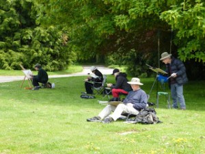
I’ve just returned from East Anglia, where I indulged in my passion for maritime scenes and collected a number of sketches of old sailing barges under way in Harwich Harbour. Despite the distractions of a giant ferry crashing into the quay and the subsequent charging around of lifeboats, harbour patrol launches, tugs and kitchen sinks, I managed to achieve some lively images which will be the subject of a future blog.
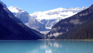
Canadian Rockies
We still have vacancies on our painting holiday to Canada on September 1st when Jenny and I take a group to the Rockies to paint some amazing scenery. I shall be demonstrating how to paint the sublime natural scenery. It is easy to be overawed by such spectacular scenery, so I will be showing how to cope with the big landscape and produce an exciting composition, as well as many other aspects of painting, whether you like to work in watercolour, oils, pastels or whatever. There will be plenty of time to paint and sketch, and if anyone wants to do a little walking that would be great, but it is optional.
The holiday runs from 1st to 14th September, and is organised by Spencer Scott Travel in conjunction with The Artist and Leisure Painter magazines. For further information please email info@spencerscott.co.uk or telephone +44 (0)1825 714310 or check the website www.spencerscotttravel.com

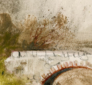
 This watercolour of Hisley Bridge on the edge of Dartmoor illustrates the effectiveness of painting masking fluid over the bridge before doing any painting, then applying very fluid washes wet-into-wet for the background, bringing the wash down over the bridge with impunity, as you can lift off the masking fluid once it has dried and hey presto! the bridge appears again. The sense of mood has been accentuated by limiting the background colours in the wet-into-wet wash, with warmer colours being applied in the bridge and foreground.