Rescuing a watercolour that’s gone adrift

I’m afraid things have been quiet on the blogging front lately as I’ve been in the Canadian Rockies for the past few weeks, painting some truly stunning scenery, and this will be the subject of a forthcoming blog.

This post covers the tricky subject of how you rescue watercolours that have gone slightly awry, or perhaps have somehow spectacularly misfired. It happens to us all. Many folk think you have to tear up the wayward masterpiece, but many watercolours can be effectively rescued even when they appear to be something of a disaster. I’ve just produced a DVD on the subject, and this covers a whole variety of techniques you can use to put things right, or simply alter a composition where you feel the need for change.

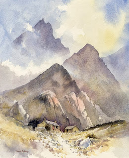
Mountain Bothy

On the left you see one of my old watercolours that I discarded years ago as I didn’t like the finished treatment: the peaks were too repetitive, the edges too hard, and the atmosphere didn’t really convince me. I felt I’d made a mess of it. When I was persuaded to do a rescues DVD I thought this would be a good lesson for illustrating methods of changing a scene.

Unlike a recent painting, over time it becomes more difficult to sponge out details and passages, but I have the advantage that most of my watercolours are carried out on Saunders Waterford paper, one of the most robust watercolour papers on the market, so I could really work hard into the paper. I also rarely use the manufacturers’ greens, preferring to mix my own, which are less staining and therefore easier to remove. Because of the hard-edged striking shapes of the peaks in this painting I realised that I would have to completely change the format to a landscape one and not include those strident peaks.

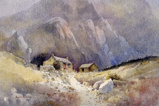
Mountain Bothy 2

My first task was to reduce the background by heavy sponging with plenty of clean water, then subduing it further with a transparent glaze of French ultramarine and a little cadmium red. This had the effect of creating a misty distance, cooler in temperature. By placing some shadow across the foreground it emphasised a lighter patch in front of the bothy, and while this was still wet I dropped in some Indian red to warm up the immediate foreground. Thus, the cool background and warm foreground suggested greater space and distance, and the buildings stand out more.

Copies of the Rescue Watercolours DVD, available for the first time this month, are available from my website  If you have any old watercolours lying around that haven’t quite worked, or have encountered a mistake you’d like to rectify, then there are many techniques on the DVD which will help improve your work. Some of the techniques are also useful to employ as a deliberate method to create special effects. There is nothing worse than finishing a watercolour only to find there is a niggling little problem to which your eye is drawn time and time again, when in fact there are almost certainly ways of solving the issue.

Simplifying Foregrounds with the Vignette Technique by David Bellamy

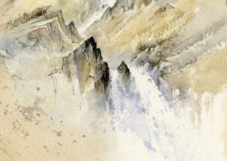
One of my favourite techniques for dealing with those troublesome foregrounds is the vignette method, which can be equally effective when used on watercolour sketches. This is especially true when you don’t want to include every bit of detail in front of you. The method can be carried out with a softening effect as though the viewing frame becomes more and more misty as it gets further away from the centre of the composition, or it can be accomplished by abruptly stopping detail while adding a few stray examples – perhaps stones, pebbles, grasses, plants or whatever is present, in the foreground.

Cascade (detail)

In this example of a cascade plunging between rocks I’ve simply splashed in a few hints of falling water with weak French ultramarine, and to the left-hand side have spattered some flecks of paint. The rocks have been faded out, although the method works equally well by rendering a few strong, hard-edged features at this point. If you find the latter method is too strident you can softly sponge away the hardness with a natural sponge and clean water until you achieve the effect you are seeking. It’s also a useful technique when you are out sketching and see those heavy rain-clouds approaching and need to finish it off at speed! Try it out – you have nothing to lose, as if you feel it doesn’t work you can always superimpose a more normal foreground over it.

Sketching in remote places

I’ve just returned from a trip to South Greenland with my friend Torben Sorensen, hence the lack of blog posts over the past month. Our objective was to sketch and paint the spectacular mountains near Nanortalik, which is about 45 miles north-west of Cape Farewell, the southernmost tip of Greenland. To gain access to the area we hired an inflatable zodiac to go up Tasermiut fjord, a 50-mile stretch with stunning peaks on either side: a rather crazy idea as neither of us had ‘driven’ such a boat before, and perhaps when we found it had a hole in the bottom we should probably have abandoned the idea rapidly.

We carried on, and had to do quite a bit of baling out, as well as heaving the craft over rocks and beaches at anything but high tide. Sunny weather blessed us most of the time, but clouds and cloud streamers added greatly to the atmosphere. When you can see everything the view tends to lose its aura of mystery.

Watercolour, of course, is supreme in conveying a sense of atmosphere. This is a rough watercolour sketch of icebergs near Cape Farewell, done on cartridge paper, which generally dries rather quickly and so makes laying complicated watercolour washes quite difficult, as in this case where I’ve had to work the darker sky round the light foreground berg. Even wetting the paper first still leaves one prone to ugly brushmarks across the cartridge paper. However, as it’s just a sketch this doesn’t matter. The important thing was to capture the subtle colours in the ice, the slightly darker overall tones on the further skyscraper-like icebergs, and a general sense of the atmosphere. At the same time I wanted to suggest the coldness of the Arctic sea. These aspects are difficult to render with a pencil.

I regard sketches as working documents which will give me all the information I need to complete a full watercolour painting at home. Photographs help a lot, but often lose the subtleties of tone and colour that is needed to produce an authentic portrait of the scene. And naturally, being out in the natural wilderness sketching is a wonderful therapy, especially when you know that you really don’t have to exhibit the result!

Using counterchange to good effect

With the current heatwave hitting the British Isles I reckon it’s rather nice to remind ourselves of those lovely cooling days of English drizzle. I’ve been working on sunny landscapes recently and will feature some in future blogs, but for the moment I’d like to discuss counterchange, an interesting feature that someone brought up recently.

Hackney

Counterchange in a landscape scene is a very effective way of adding interest to a passage or solving a tonal problem. At its simplest it could be a change in tone across a ridge, hill, forest, mountain, or any background mass to create a tonal range running from light on one side to dark on the other, while at the same time adjusting the sky in a similar way so that the dark part of the sky stands against the light part of the hill, and vice versa. In this watercolour of a cobbled street in Hackney you can see I’ve used the method vertically on the right-hand wall just to the right of the lampost.

In this instance I’ve included it for interest rather than to solve a problem. Where the method is extremely useful in solving a tonal problem can be, for example, where you have a house with a light-coloured wall set against a dark background: if the roof is dark it will get lost in the dark background, and if it is light it will lose itself against the light wall. By laying a graduated wash over the roof, darker at the bottom and graduating to a lighter top where the roof abuts the darker background, you can thus make both top and bottom of the roof stand out, thus causing a counterchange effect using the graduated wash. One of the most simple examples of counterchange can often be found on telegraph poles or winter tree-trunks where they show up light against dark vegetation at the bottom, and dark against the bright sky at the top, depending on the light of course.

This particular painting is featured in my Skies, Light & Atmosphere book available on my website with a special offer package of book and DVD, available only from the site or my demonstrations. Don’t forget to watch out for these effects in the natural landscape when you are out and about. You can learn a lot even without your painting or sketching gear!

Painting on the new Bockingford Hot Pressed paper

It’s always great fun to try out new materials and lately I’ve been testing the new Bockingford hot pressed paper from St Cuthberts Mill. Bockingford is, of course, a well established and popular make of watercolour paper, so how would the addition to the range fare? It did not take me long to find out when I painted a rural farm scene.

Farm near Shere, SurreyI enjoy working on hot pressed paper, although it can be a little more challenging for the inexperienced watercolourist because it dries so much more rapidly than a NOT or rough paper. The advantages of using a hot pressed surface are that you can achieve really sharp, crisp edges, and it lends itself to detail. Colours can also appear more vibrant. The biggest dangers caused by the quicker drying is the possibility that you may find runbacks forming and messy brushmarks can look unsightly if not enough water is used with your colour application and washes.
    Make sure that your mixtures are really fluid, and work quickly once you begin applying a colour. With large washes, unless you need hard edges within a wash area it will help if you lay a wash of clean water over the area first – do this after you have mixed the wash you are about to apply, otherwise the water may well dry before you can lay the wash.
    I painted this scene on a Bockingford 140lb (300g) pad of 14″ x 10″ hot pressed paper and was absolutely delighted with the response of the paper. It is a superlative product that took the washes well and should be in the possession of every watercolour artist. It is also excellent for line and wash work. The paper comes in both pad and sheet form and is superb value in its high quality and economical price. I cannot rate it highly enough.
    For further information see the St Cuthberts Mill site