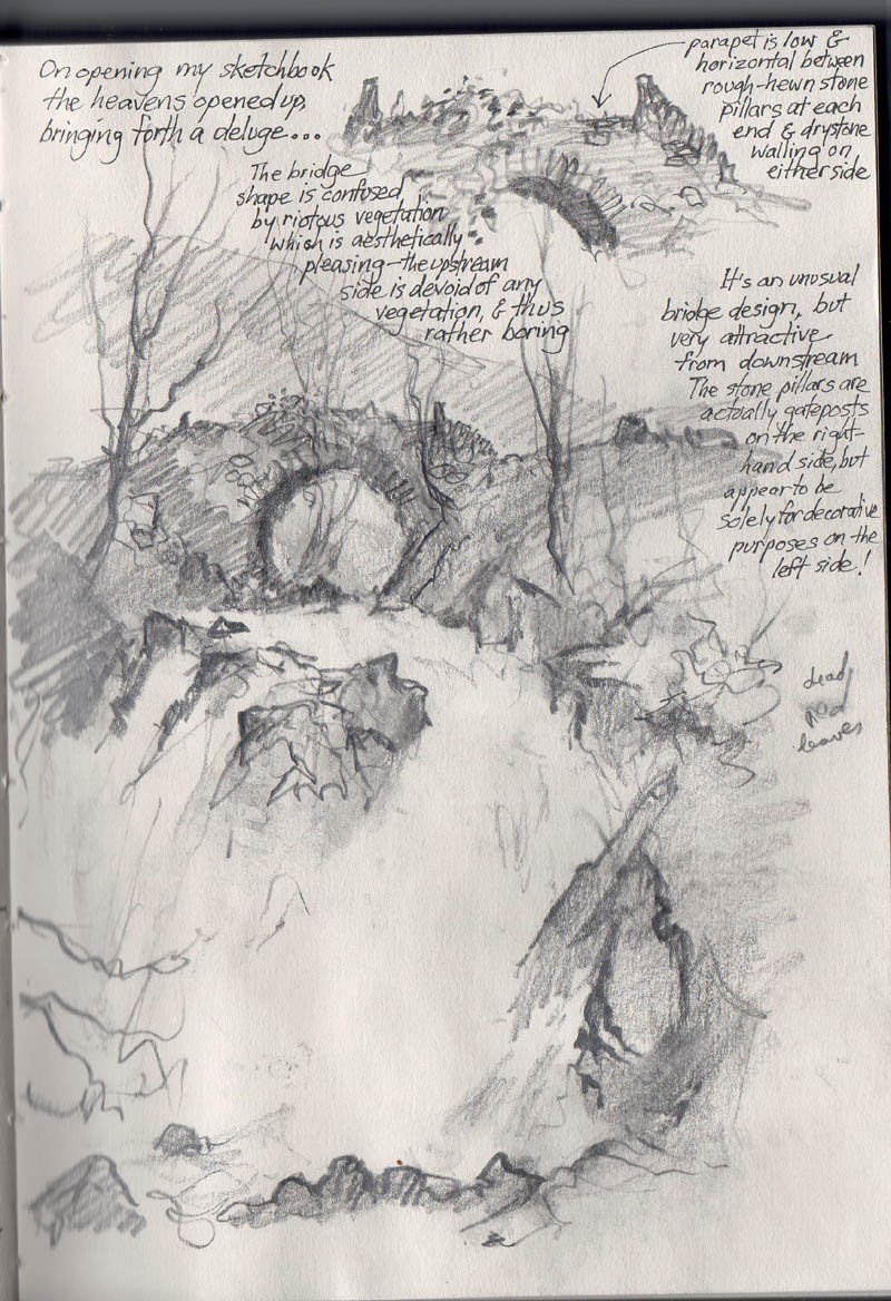
One lovely technique in watercolour painting is to float two colours into each other and allow them to merge, sometimes adding more of one colour or other while they are still wet, and then working a dark shape up against them when they have dried. This can really make your work sing, whether you paint landscapes, still life, flowers or figures.
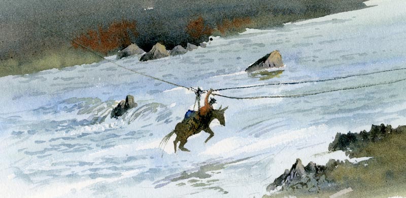
 In this small section of a painting the bush on the right-hand side has been painted by washing in two colours side by side – cadmium orange and light red – and letting them blend in. Later I painted in the darker purple-grey to the right of the bush, taking it up to the top, in a hard edge, while allowing flecks of the original colours to remain here and there. Afterwards I added the shadow under the bush and finally the branches. This approach gives a rather pleasing variegated effect to the subject and is worth practicing.
This painting is part of Wild Highlands, an exhibition to be held at the John Muir Trust Wild Space Visitor Centre in Station Road, Pitlochry from 17th April to 18th June. Do come along and support the John Muir Trust if you can, as they are doing all they can to keep the Scottish Highlands wild and beautiful, and free from inappropriate industrial development. I shall also be demonstrating painting Highland scenery in watercolour at the Pitlochry Festival Theatre in aid of the Trust at 2pm on 23rd April. Tickets are £10 and may be booked by telephoning 01796 484626
For details of the exhibition see www.jmt.org/wild-space-gallery-shows.asp or telephone 01796 470080 or email jane.grimley@jmt.org The Highlands in spring are absolutely magical, so why not make it a wild painting break?