David Bellamy – Capturing the colours of Autumn

 Once again, autumn is with us, and the opportunity to indulge in bright, warm colours in our landscape paintings. This time last year I found the striking colours in the Bavarian Alps absolutely mind-blowing, with every day in brilliant sunshine.

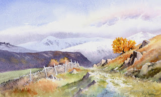
This scene shows a track leading to Little Langdale in the English Lake District. I was lucky at the time to encounter snow on the distant fells, and this accentuated the bright colours of the right-hand small tree. For this I used two of my favourite Daniel Smith colours – Aussie red gold, which was applied first and when this was dry I added transparent red oxide. These two work extremely well for autumn scenes. The dark ridge in the middle distance was rendered with Moonglow, another useful colour, and in places I have pulled out the colour with a small sable to indicate lighter patches.

The painting is reproduced in my Landscapes Through the Seasons in Watercolour book, signed copies of which are available from my website

Watch out for those autumn colours and make sure you are armed with the right colours……..and if you get some snow as well, then that’s a great bonus!

David Bellamy – Painting autumn scenes in watercolour

Autumn is upon us, and with the trees turning colour it’s a great time to be out capturing those magical views, whether in sunshine, rain or whatever: rain can create more atmospheric scenes, but if you can catch that moment after a shower when the sun comes out and makes everything sparkle it can be truly magical – watch out for those stunning reflections of colour and light in the puddles. 

This year autumn is also bringing out my new book, Landscapes Through the Seasons, which has just been published by Search Press. It is in fact an expansion and update of my Winter Landscapes book – many people were asking about a summer book, but with other books in the pipeline I could not have written a whole book on summer landscapes for several years. The spring and autumn sections have also been expanded.

The illustration shows a watercolour sketch done on a cartridge sketchbook on a sunny November afternoon and reproduced in the book. If you are out sketching at this time of the year it really does pay to use colour, whether in watercolour, watercolour pencils, acrylics, inks or whatever you fancy. Note that the most powerful  effects occur when abutting the complementary colours of purple and orange against each other – if that tree of glowing orange doesn’t quite come in front of that distant purple hill, then give it an artistic shove and see the effect. Likewise warm yellows against the blues and purples will make your autumn scenes sing. Flying leaves and trees with just a few single leaves remaining can add to the season’s visual treasures, and these can be achieved in watercolour by little dabs of masking fluid. By applying a dark colour over these dabs you can then create sparkling light leaves when you rub off the masking fluid. Let your yellows, reds and oranges run into one another in the foliage to vary the overall effect.

The later paintings in the book are carried out with Daniel Smith Extra-fine watercolours, and many of these are exceptionally effective for autumn colours, such as Aussie red gold, transparent red oxide, moonglow and quinacridone Sienna. Quinacridone gold and gamboge are also great colours for this time of year. We all need something new to brighten up these difficult days of lockdowns, so treat yourself to some of these amazing colours.

David Bellamy – Making the most of summer landscapes

I’ve at last managed to see my grand-daughter after nine months…..far too long a time, but the re-union was a wonderful moment! Bit exhausting as well, keeping up with a lively 3-year-old. That, and other urgent work has kept me from doing any blogs for 6 weeks, I’m afraid.

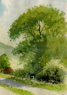
Summer still clings on with some beautiful days, the trees in fine form. When painting summer trees in full leaf I find it easiest to do the foliage in two stages, firstly the lighter colour – usually green – and then the darker, shadow green. It pays to run your branches into the darker shadows, losing them naturally rather than in stark contrast. Make sure you stab little spots of the green outside the main boundary of the foliage as you see in the watercolour below, otherwise your foliage will appear lumpy.

Just above the stile and slightly to the right you will see some light spots of yellowy-green. These were achieved with gouache, which being opaque will show up over dark areas, unlike pure watercolour, and here they suggest detail within a dark, featureless part of the tree. The stile and some branches in the bottom right-hand bush have been done with the negative method whereby the darkest passages have been painted with a fine no. 6 sable brush to avoid those features.

This painting is featured in my new book Landscapes Through the Seasons, to be published shortly by Search Press. Amongst other things, it includes introducing flowers into the landscape, managing summer greens, brushwork for foliage, the power of introducing spot colour, coping with riotous summer foregrounds, emphasising a sense of spring and fiery autumn colours. The book is actually an extension of my Winter Landscapes book, as so many have enquired about one on summer landscapes. You will find details on my website, www.davidbellamy.co.uk in a few weeks time.

Make the most of what is left of summer and make sure you gather as many subjects to paint in sketch or photographic form before winter arrives and we get any further lockdowns. Painting is such a wonderful antidote to Covid-19!!!

David Bellamy – Enjoying the detail in a painting

How do you cope when you are presented with a complicated scene such as a harbour full of boats of all colours and sizes? Beat a hasty retreat and look for a simpler subject? I love painting and sketching boats, and there’s always a way round the problem: you can leave out craft that don’t appeal, reduce their number, enlarge one so that it hides two or three others, or perhaps cast a dark shadow over the ones further away.

    This is a watercolour I did of Oare Creek in Kent, a place crammed with lots of lovely craft, and although there seem to be a lot in the composition I did leave many more out. This is one of those works that doesn’t have just one centre of interest – there is a whole line of them! I do this sometimes as it makes quite a change, and some buyers do enjoy a mass of detail, and to get a sense of the place you do need to suggest that many boats line the creek, especially if working to commission.

    On occasion in scenes like this I lay shadow across many of the boats, simply suggesting them, and highlight the main ones – the focal point – with strong lighting. If you wish to subdue one or two off-centre then just paint them in silhouette as I have done with the boat on the extreme right background. The masts and gulls were rendered with white gouache when everything else had been completed. If need be I create dark areas deliberately so that white gulls can be placed there and stand out. This is at fairly low tide so much of the mud-banks are revealed. To avoid too much monotony I have made some lighter and on the right bank splashed in some cadmium red to add interest. The painting was done on Saunders Waterford hot pressed, 140lb weight.

    Now most of us are able to get outside do make the most of the summer days to find some new subjects. This is important not just from the point of view of finding new material to paint, but getting outdoors rejuvenates us and gets us away from the lethargic indoors syndrome that can deplete our enthusiasm for creating anything. There is nothing better than perching on a rock warmed by the sunshine, overlooking a stunning view while sipping a cappuccino as you sketch. I’ve been out there with my new Daniel Smith watercolour box of gorgeous half-pans lately, so it’s been a double pleasure!

David Bellamy – Fun techniques during Coronavirus

 It has been a chaotic year so far, making it difficult to find time to write even though there is so much to say. Coronavirus has made things even more difficult, of course, but we persevere. Thankfully, as artists we can beaver away at home on our paintings, but what can we do if we feel inspirationally challenged?

 One way is to get out all those old paintings that have not worked. I have loads and sometimes go through them to see if I can use them in some way, or find just a part of the overall composition that might offer some hope. Over-painting with a weak glaze is a favourite technique, sometimes over part of the painting, sometimes over everything, and this can subdue parts you don’t like and at the same time highlight those parts you don’t touch.

 I’m always looking for ways to improve paintings and often it can be fun working on old paintings, perhaps not taking it too seriously. One technique you might like to try is brightening up dull colours with Derwent Inktense pencils. Because they are so intense I work over colours such as a dull green with an Inktense light green or yellow as I have done in this small watercolour of a rustic cottage, and this has resulted in a much more pleasant scene with a sunnier accent than previously. Note also the sky – a very simple one, but because I used sodalite genuine, a strongly-granulating colour from Daniel Smith it still has impact even without any cloud detail. The painting was done on Saunders Waterford high white NOT paper which is absolutely great when you want to rough it about a little with extra rubbing with the Derwent pencils, for example. The paper can take quite a lot of punishment and I love working on it.

 I’ll get back with more ideas shortly, so try to keep up the painting. Sadly all my workshops and demos have had to be cancelled until the end of July, including our great favourite, the Patchings Art Festival. The course in St Davids may well now be rescheduled for late August or early September, Coronavirus permitting, and I hope that the one at D’Alvaro in Spain in October will still be able to go ahead.  Keep safe, and keep painting!